Paris!!!

Paris!!!
girlie fun and of course research for our project! :)

Wednesday 27 April 2011


I have been trying to experiment with combining Digital Print with Screen-print and i think it is starting to take shape. for the project i am wanting to create a 15 piece collection all for womenswear 2012. I have found myself producing more placement prints then repeats as i feel it is my strongest area when designing. I have used Adobe Photoshop to design all my designs even if i intend to screen print them i just prefare this process and the look i can create by using the computer.


this is a drawing i produced using a fine liner taken from a photograph i took from the natural history museum I joined the skull with another photograph i took from a derelict industrial estate in Hartlepool. i really like how it gives the impression of its neck.


This is a drawing taken from a photograph i took near Hull.


i really love my background of this drawing i used food colourings and a roller to create texture. i really like how bold the yellow still is on it :) my skeleton horse took me for ever to draw but i love it, i think this is one of my favourite drawing sheets


Hi guys,

I am currently battling through my final major project, the theme i have based it on came from a trend website called WGSN. The trend is called 'Fable', its a very strang theme based on dark fairytales and all things weird!!! I really thought this would be a good change for me and try drawing different things that i have never really drawn before. Hope you enjoy :)


From the floral drawings i then create womenswear dresses in garment sahpes, i think they work really well as a collection i think in this project my stromg point has been my placement prints. All of the designs have been digitally printed and designed on Photoshop.


Some floral drawings now
This project is taken from my second year work, I wanted to share this with you as for me it was a nightmare but it shows what you can achieve if you dont give up :) I think i disliked this project as it was embroidary, I am a printed I love everything print!!!! When looking back i think this does work really well mixng the embroidary with print and I love the collection.


The waiste coat above was deeply influenced by baroque art. I took inspiration from the pop art era to create a colour palette. I think this works really well on this design aas it creates a much more creative and contemporary look to the piece.


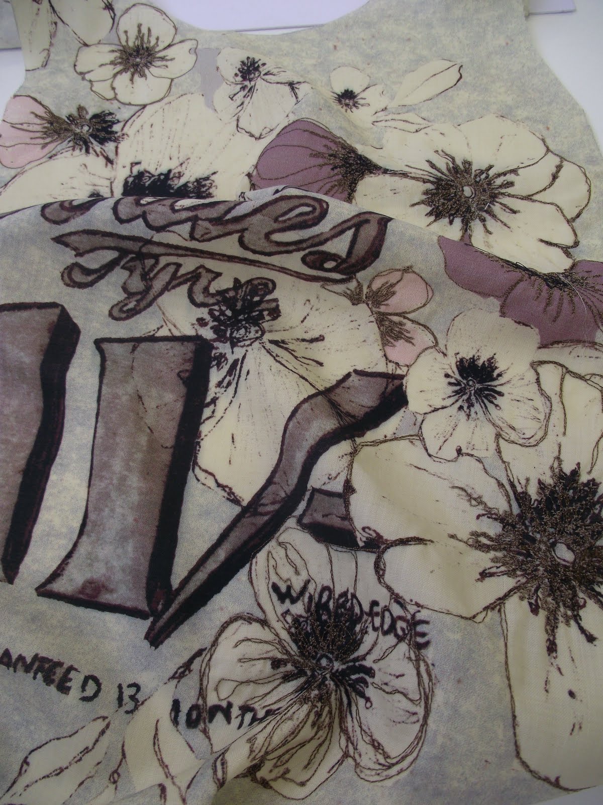
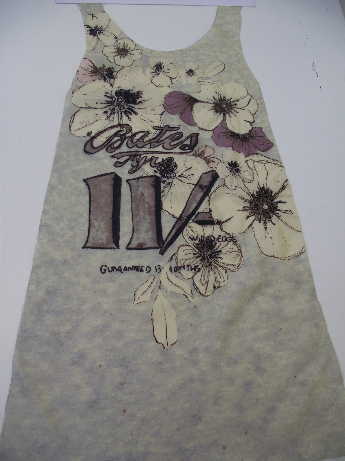
I used a lot of applique on this design as i wanted a very textural look to the piece. I am really happy with how it looks.


I hated this design when i was embroidering it as it took me far too long, but i am really happy with the final outcome and i am especially pleased that i didnt give up on it :)


I love this photograph of this design i think it has captured the colours and you can see how much embroidary and work was put in this sample. I am really happy with this design i think it is my favourite out of the full collection.


Hi all,


the year has flown by way to fast!!! i was sorting through my portfolio and came across some of my second year work, and thought i would share it with you all. I hope you like :).

Wednesday 21 April 2010

Gift Project
For the gift project we worked alongside of Tigerprint which is a part of the gift company Hallmark. i have attached some images of my work for this project. not only did we have to design cards, wrap and tags we also had to design notebooks, diaries and calendars.